
Typography for beginners: how to choose a typeface for paragraphs
In this post I’m going to go through some of the considerations necessary for choosing the right typeface for paragraphs.There are a few factors that come with choosing an appropriate typeface. These are are x-height, contrast, width and context. After reading this post you will gain the understanding necessary to make the right choices to choose legible typefaces.
337 views


In this post I’m going to go through some of the considerations necessary for choosing the right typeface for paragraphs.
There are a few factors, that I consider, with choosing an appropriate typeface. These are are x-height, contrast, width and context. After reading this post you will gain the understanding necessary to make the right choices to choose legible typefaces.
x-height
The way we determine the x-height of a typeface is the height of the lowercase letters. We want this to be a good height, but not too tall otherwise they could be confused for capital letters.
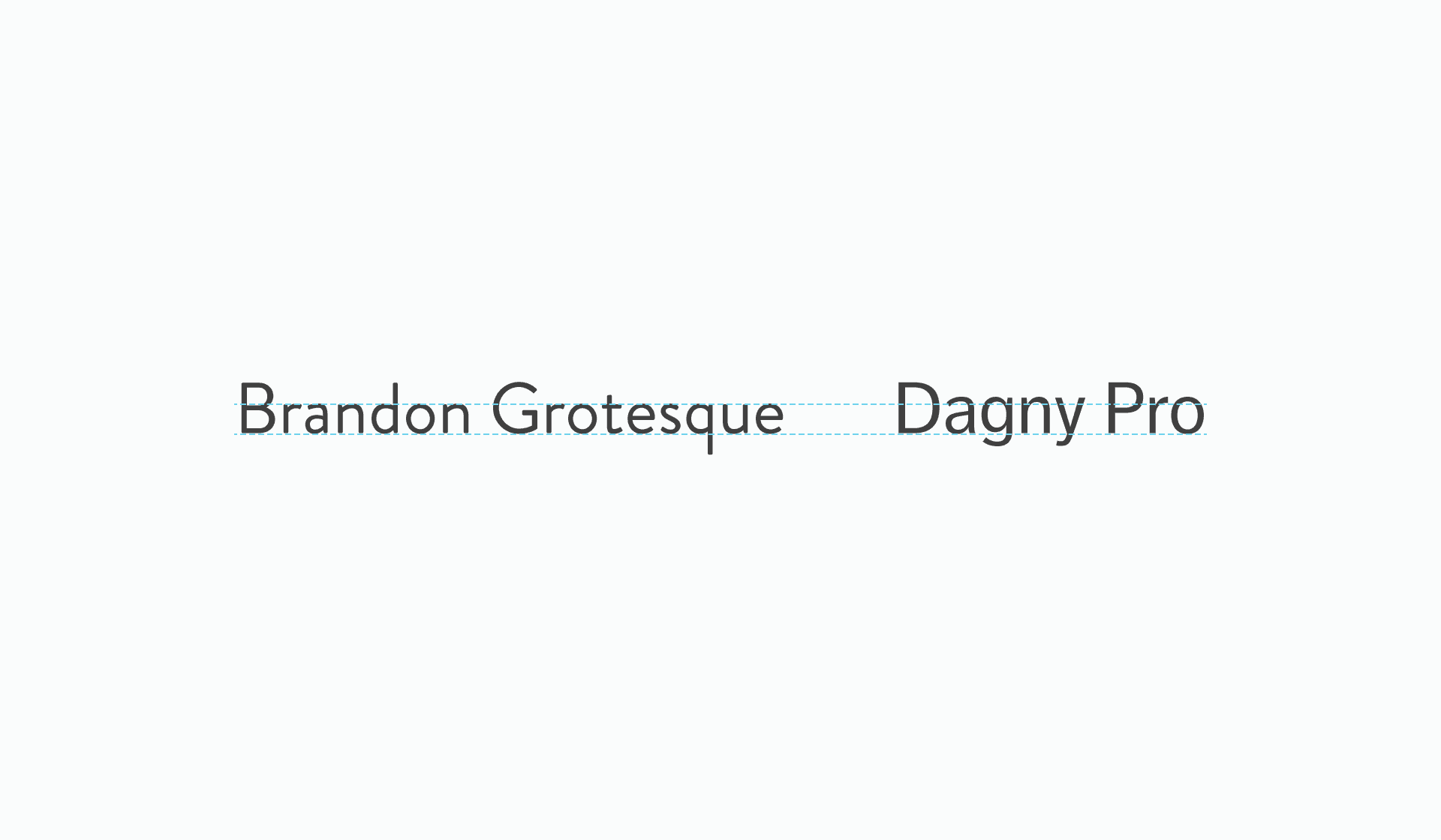
x-height is in the name it’s the height of the letter ‘x’, typically all lowercase letters conform to this. This image shows that Dagny Pro has taller x-height over Brandon Grotesque.
Now looking at the typefaces in paragraphs.
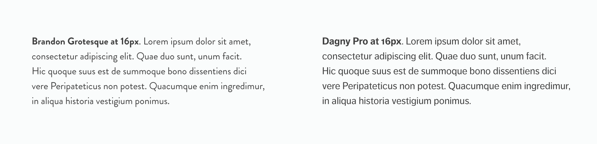
Both typefaces would be suitable for headings. Though Dagny Pro is the better suited for paragraphs.
Contrast
When referring to contrast, in terms of type design, this is how thick and thin parts of a character are.
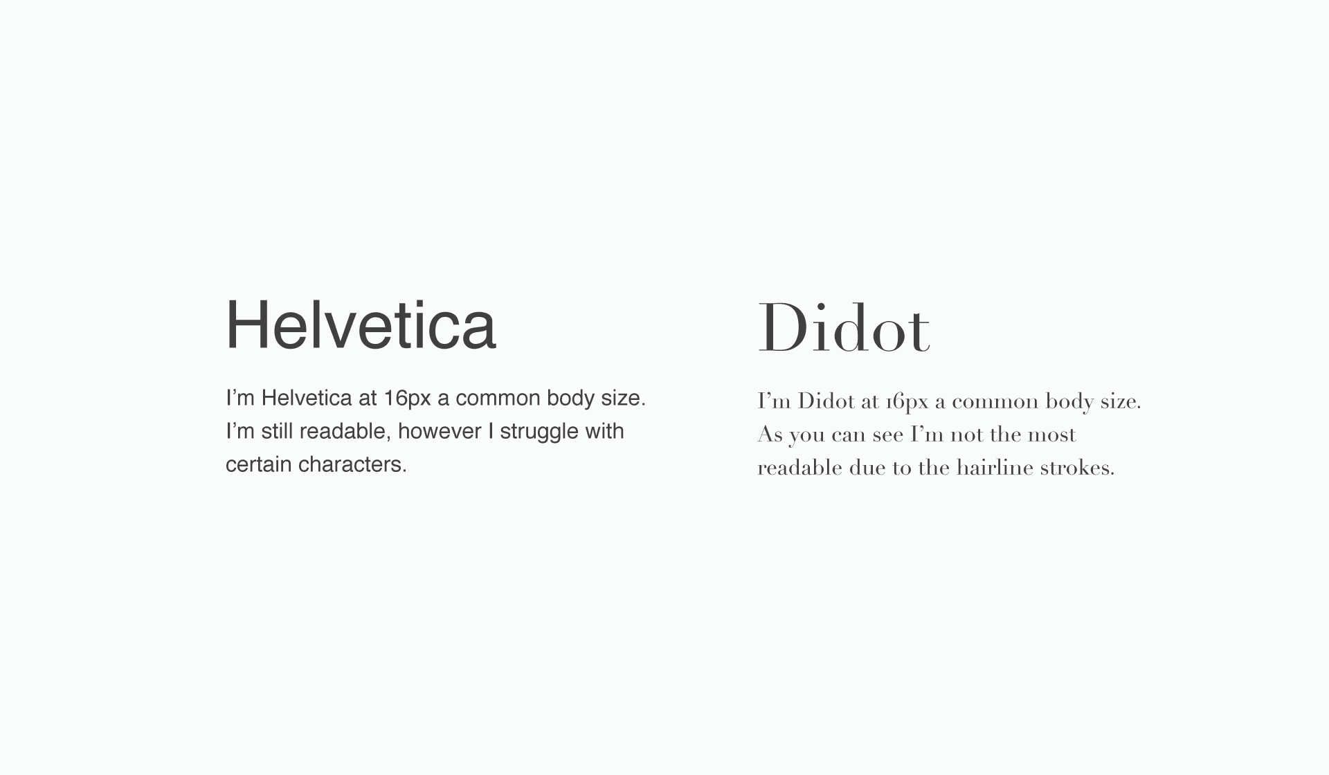
Helvetica and Didot, two very different typefaces. Helvetica has low contrast, Didot has high contrast.
Find the balance with contrast
You want to strike the balance with contrast. Helvetica isn’t a good typeface for paragraphs. One reason is it’s difficult to see the difference in the characters 1, i, l or I. Which is partly down to the low contrast.
Nor would Didot be considered a good typeface for paragraphs. This due to the hairline features it has. However it would be suitable for larger size headings.
Width
It refers to the width of each letter, each typeface will vary. As each of them will have a different intended purpose. Many will clearly state whether they are a narrower typeface or an extended typeface. For paragraphs you will want to avoid narrow and wide typefaces. The terminology used is ‘condensed’ and ‘extended’.
Why avoid ‘condensed’ and ‘extended’
Condensed and extended typefaces have uses for headings, or decorative purposes, for fitting more or less on one line. Using them for paragraphs would go against the ideal line lengths you will have put in place.
This isn’t the most crucial of steps, it’s more something to be aware of.
Context
It’s about choosing the right one for the right subject/situation. To put it to the extremes, you wouldn’t use comic sans on a corporate website. It can get trickier than just recognising to avoid the ‘comic sans‘ of all the choices out there.
Read the designers intentions
The majority of type foundries and hosts, provide this information. These can be what the designer had in mind, for the use case. H&Co, Typekit and Google Fonts (albeit harder to find) are good examples of websites that provide this helpful information.
H&Co’s Sentinel as an example
From the Antique style it borrows a program of contrasting thicks and thins…Planned from the outset to flourish in small sizes as well as large.
What I take from this is: an antique typeface, that works well at small and large sizes. It would work for shops or fashion blogs, looking to add some character to their pages, to name a couple of things. It’s a versatile typeface.
Understand the sub classifications
Typically typefaces are classified as serif, sans serif, script & decorative. These are also divided into sub classifications. To go into detail is an article in itself. Fonts.com provides an excellent guide, which lists all the sub classifications with some history about them.
Finishing thoughts on personal preference
Of course personal preference will play a big part in your typeface choices and that’s fine. After all you will always end up with a couple of suitable choices. It’s only a problem when you’re choosing something that clearly doesn’t meet the criteria of the website.